Designing an agenda for 2,000+ participants

Designing a seamless agenda experience to help thousands navigate a multi-track, theme-based AI conference with ease.

Role

UX/UI Designer

Duration

4 months

Team

1 PM 1 Designer 1 Developer

Designing an agenda for 2,000+ participants

Designing a seamless agenda experience to help thousands navigate a multi-track, theme-based AI conference with ease.

Role

UX/UI Designer

Duration

4 months

Team

1 PM 1 Designer 1 Developer

Introduction

Agenda for an AI conference

TechEquity Ai is a nonprofit organization dedicated to making AI accessible for everyone. Their main event is the Ai Summit, a conference that aims to break down barriers and ensure that everyone can learn and leverage AI for good. I joined their team earlier this year to update their website in preparation for the Fall 2025 Ai Summit.

Problem

Previous agendas were presented as static lists, creating a confusing and inconsistent experience for attendees.

Attendees struggled to navigate multiple tracks and themes or plan their personalized schedule with the previous agendas. A redesigned agenda would streamline planning, reduce confusion, and help attendees focus on the sessions that matter the most to them.

Solution

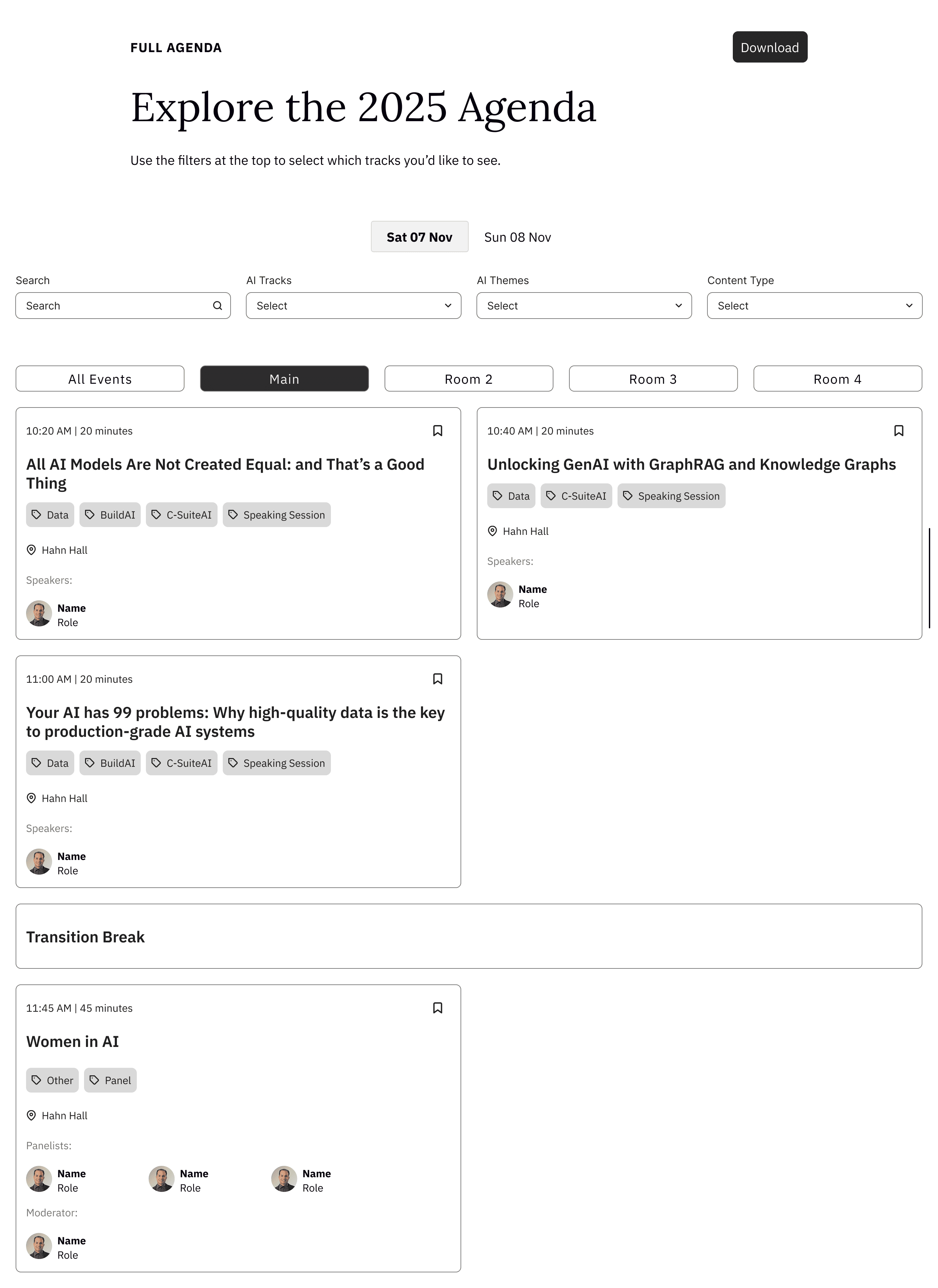
The agenda was redesigned with interactive filters, day-specific tabs, and session cards to make it easier for attendees to explore and plan their schedule.

These tools help attendees quickly narrow down sessions and understand the structure of each conference day. The improved layout makes discovering relevant content and building a personalized agenda faster and more intuitive.

01 - Filters

Multiple filters, including track, theme, and content type, make it easier to find sessions.

02 - Tabs

Day and location tabs break down the schedule even more.

03 - Cards

Cards with important details, including content and presenters, while leading to additional information round out the experience.

Research

A competitive analysis was conducted to understand existing agenda designs and identify opportunities for improvement.

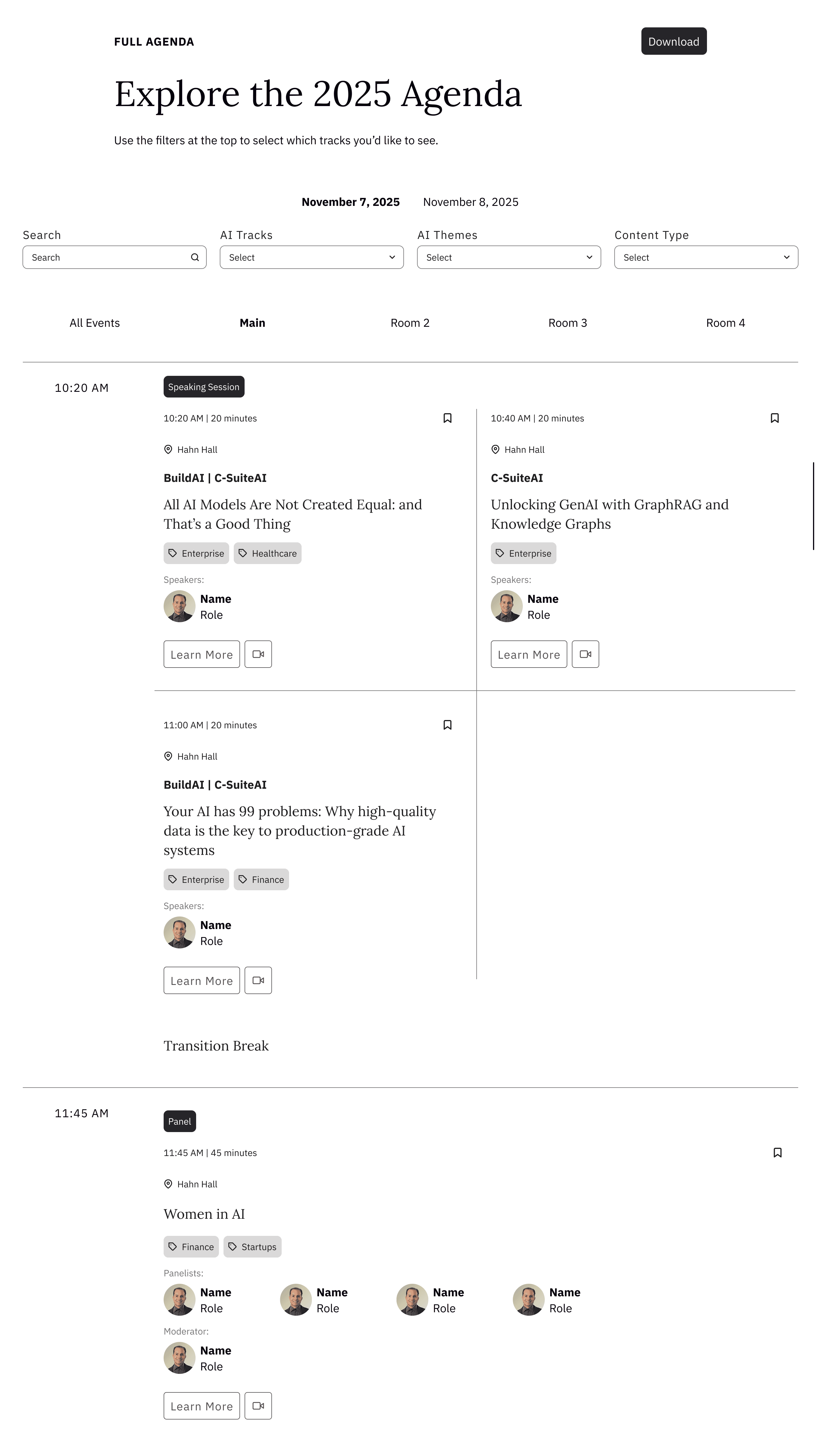
I analyzed agenda pages from six AI conference competitors, noting common patterns and unique design elements. From this research, I recommended implementing day-specific tabs, search and filter functionality, and a layout with separate time and details columns to improve usability.

Day-specific tabs

Attendees can focus on the events of each day.

Search and filters

Attendees can further find specific sessions.

Detailed event cards

Attendees can quickly scan key session details at a glance.

Wireframes

The initial wireframes were created based on research recommendations and iterated to refine the agenda’s layout, navigation, and interactivity.

I explored multiple layout and card design options across seven rounds of wireframe iterations before finalizing the design. I also had to consider WordPress constraints and time limitations to ensure the design was feasible and completed before the event.

  • initial wireframe with all recommended features

  • nested tabs with no separate time column

  • top filters with room columns and different card sizes

  • top filters with nested tabs and same card sizes

  • side filters with nested tabs and same card sizes

  • time column with different card sizes and no borders

  • final wireframe iteration

Final Designs

Both web and mobile high-fidelity mockups were handed off to development.

After creating and further refining three iterations of high-fidelity mockups, I handed them off to development. You can view the full agenda page by hovering over the image below.

Results

Attendees navigated the conference more smoothly with the final agenda design.

The final agenda design addressed the key pain points of previous versions, including confusing navigation and lack of interactivity. With a more intuitive layout and improved filtering options, attendees were able to quickly find and plan sessions, leading to a smoother, more efficient conference experience.

0+

Views

Visitors exploring the agenda

0+

Active users

Attendees interacting with the agenda

0min

Avg. engagement time

Average time per user