
Introduction
Mentorship matching for a nonprofit tech career platform
Wevise is a US-based nonprofit mentorship platform designed to make careers in the technology industry more attainable through equitable access to guidance and support. By connecting underserved and disadvantaged individuals with free, on-demand mentors, the platform addresses gaps in access to career mentorship and helps users navigate education and career opportunities in tech.
Problem
Mentorship matches on Wevise were often misaligned, making it difficult for mentees to receive relevant and meaningful guidance.
Although the platform allows users to select identity- and experience-based tags to inform matching, the system relied on a simple algorithm that weighed all tags equally. This approach deprioritized mentees with fewer selected tags and failed to account for the varying importance of different identities or needs. As a result, mentors and mentees were frequently paired based on surface-level overlap rather than true compatibility, limiting the effectiveness of the mentorship experience.
Solution

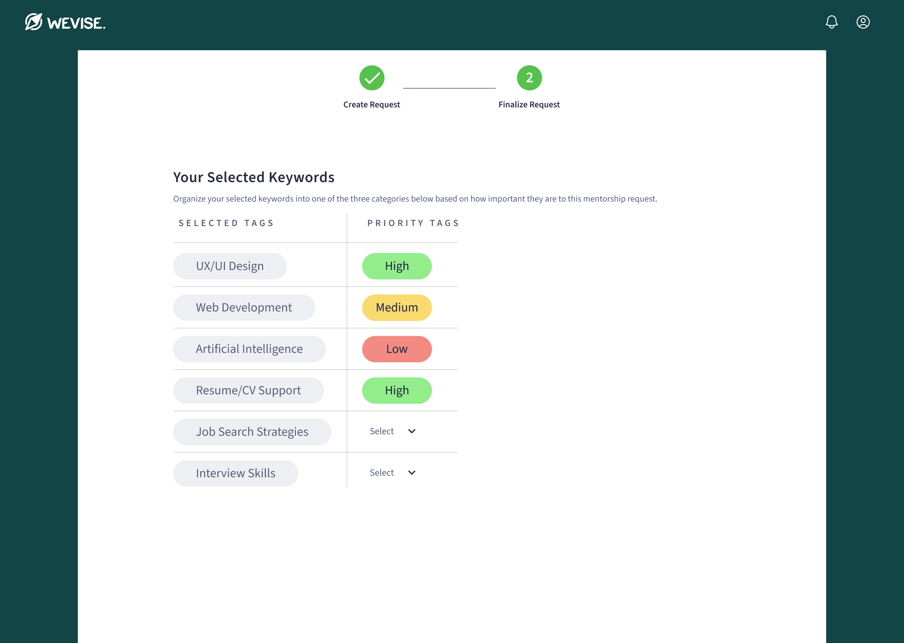
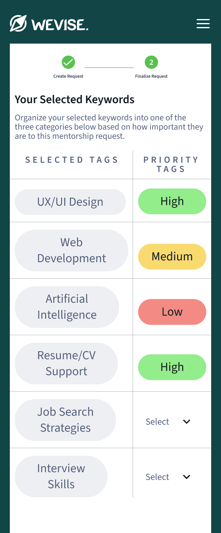
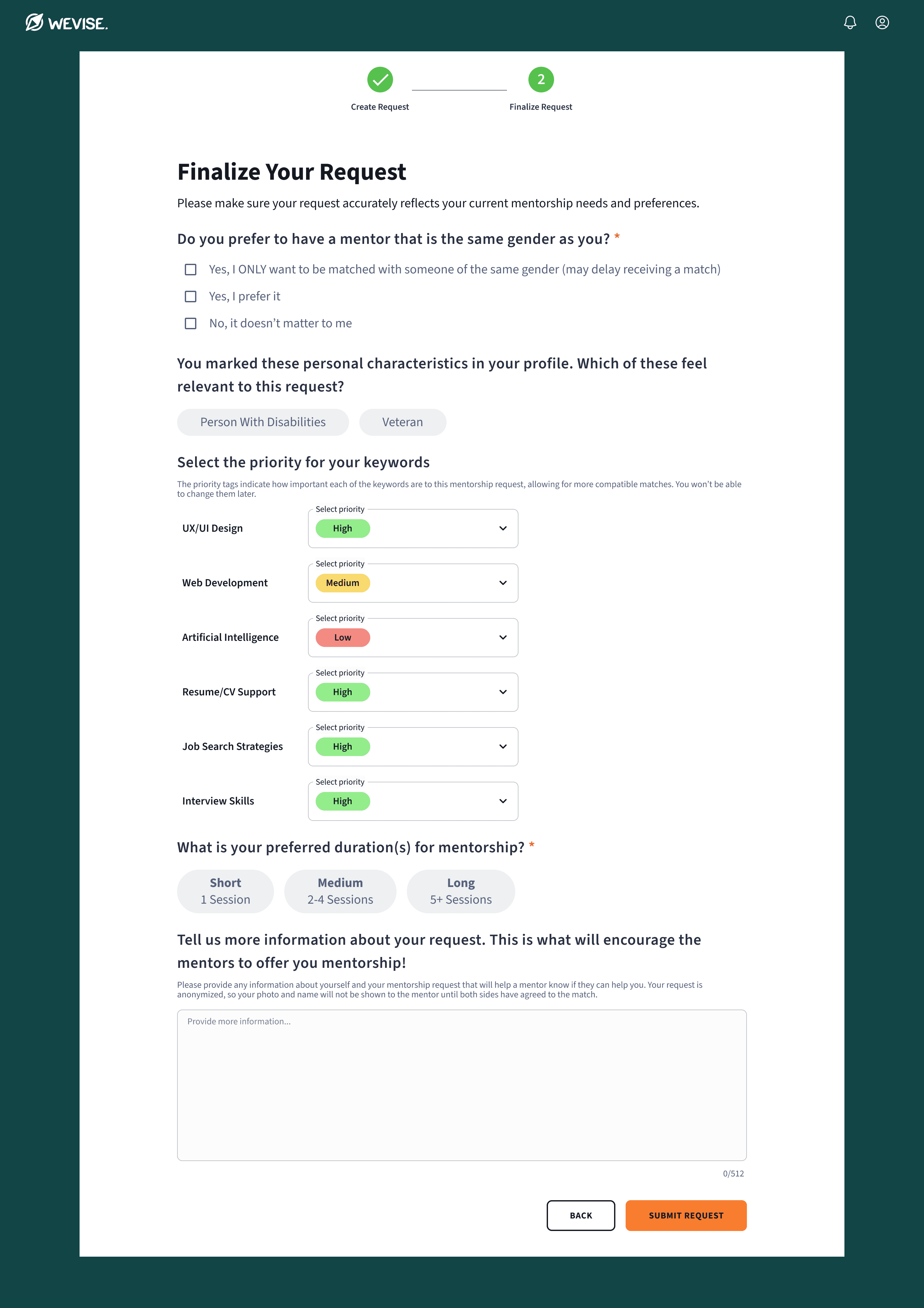
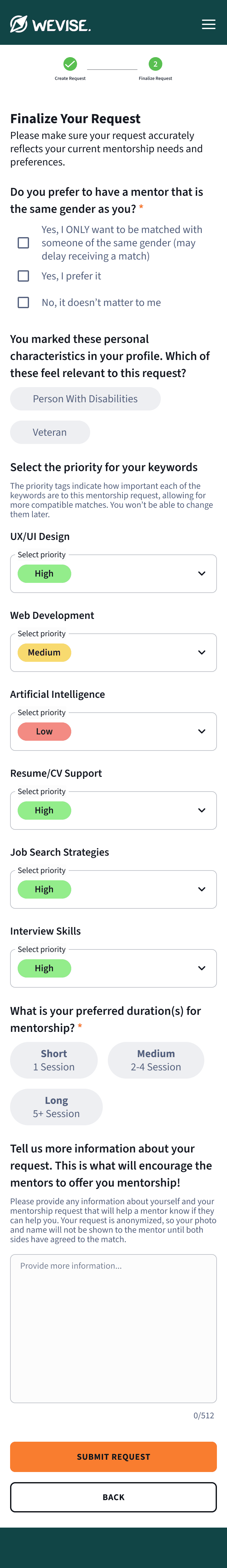
Members can organize their tags by selecting individual priority preferences to find better aligned matches.
Research
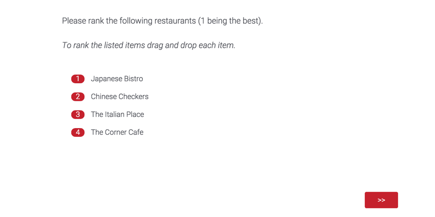
Rank Order
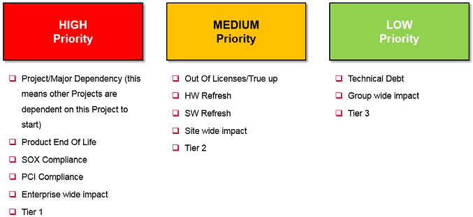
Priority Table
Radio Button
Dropdown
Design Phases
Initial designs and final iterations, spanning several months
As a nonprofit with an all-volunteer team, development capacity often fluctuated. I created the initial designs in 2023 while navigating team turnover and limited resources. In 2024, I fully redesigned the feature, making major updates to improve usability and prepare it for handoff to the new development team.
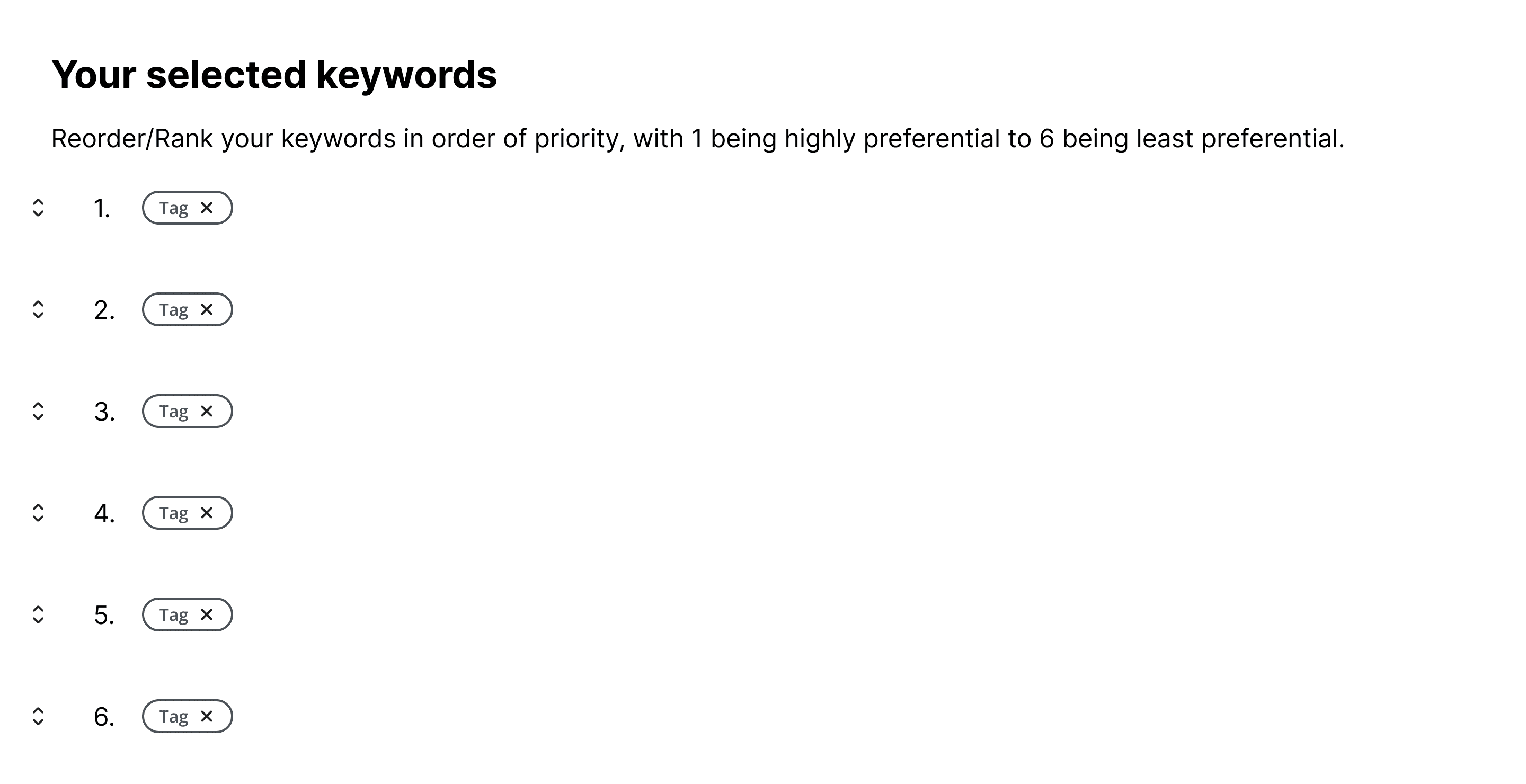
Wireframes – 2023
I initially designed a rank-order interface where users could drag and drop tags to set priorities in a list. I received feedback on using a table layout with three categories instead: high, medium, and low.
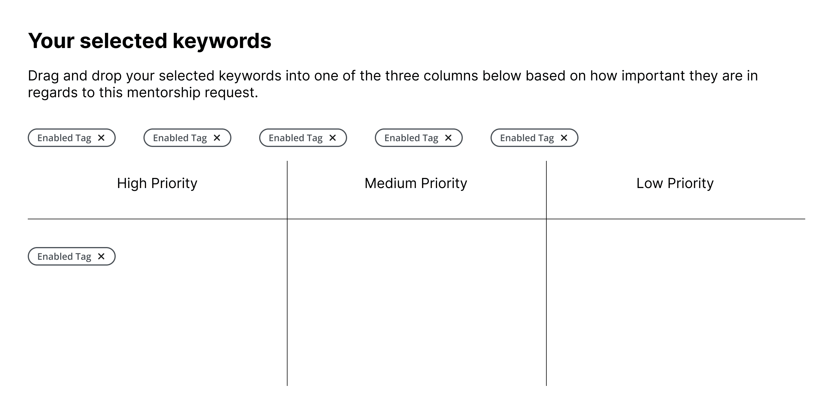
Initial Final Screens – 2023
The three-category design was approved and handed off for development, which stayed there for over six months.

Redesign Iterations – 2024
Six months later, I revisited the designs to fix key issues before launch. I explored two high-fidelity options to improve usability and accommodate these constraints:
Mobile responsiveness: The previous layout didn’t adapt well to smaller screens.
Accessibility: Drag-and-drop wasn’t usable for all users.
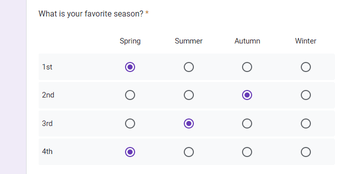
Multiselect Listbox
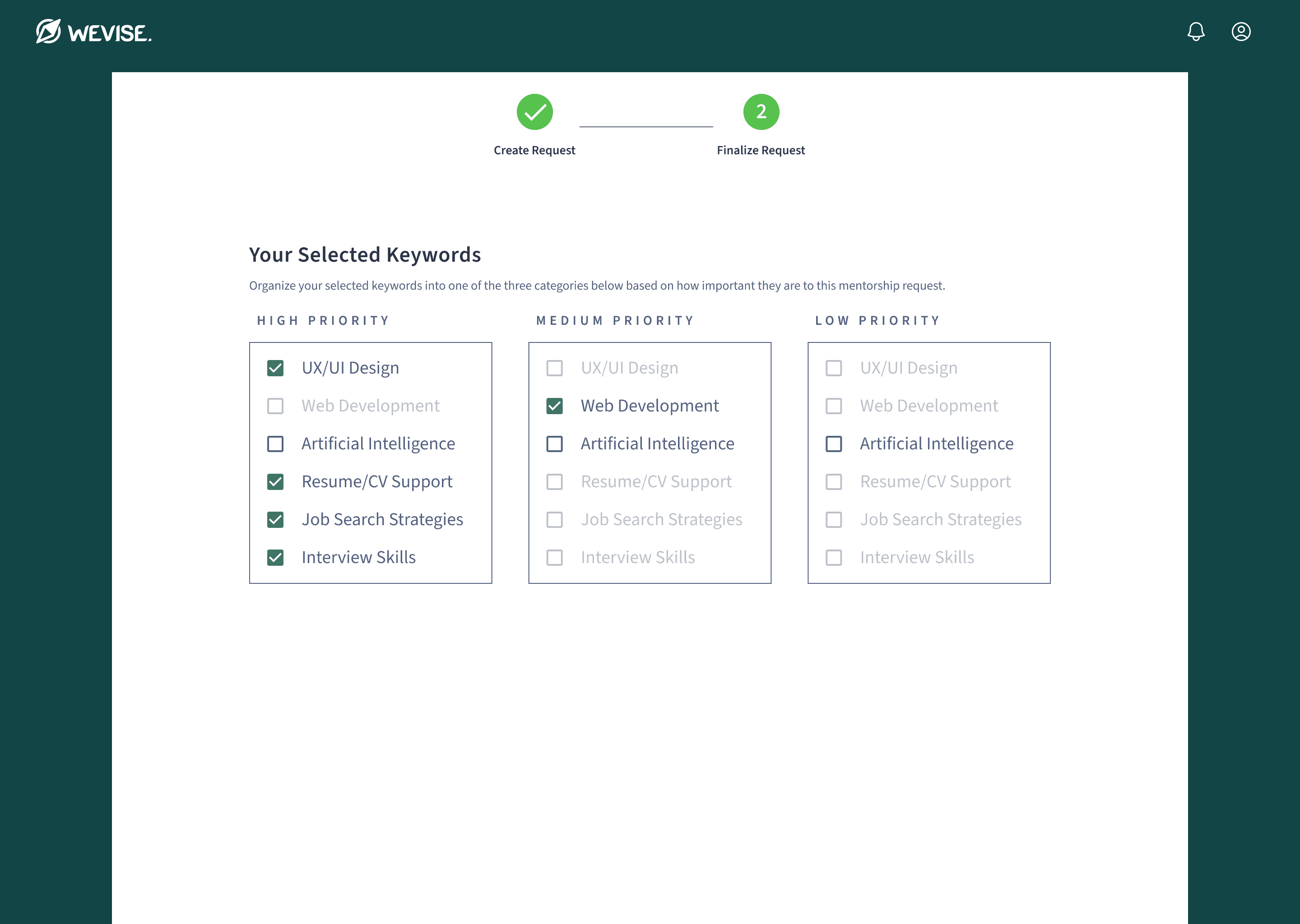
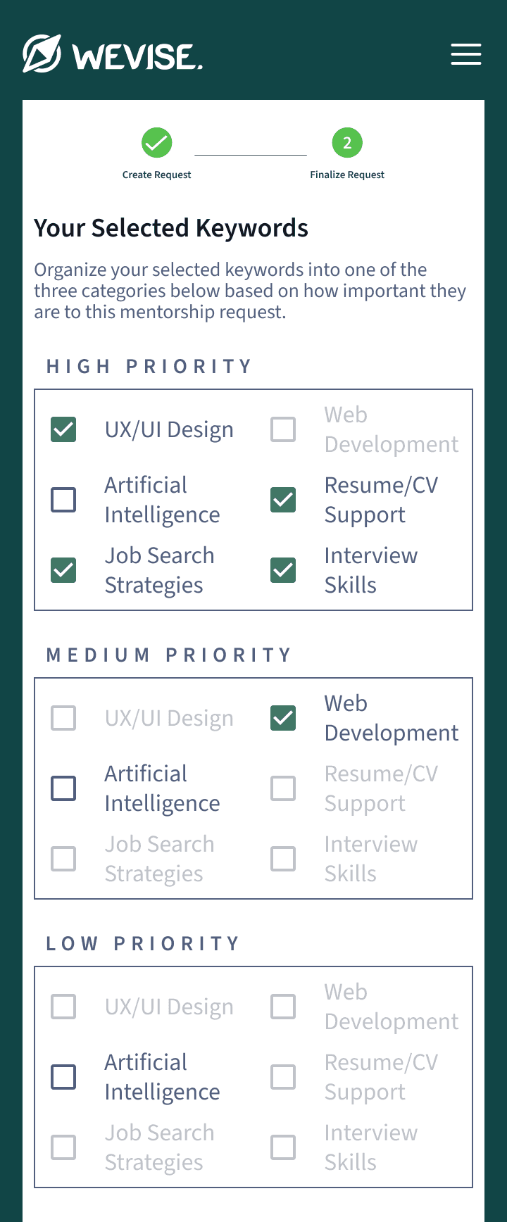
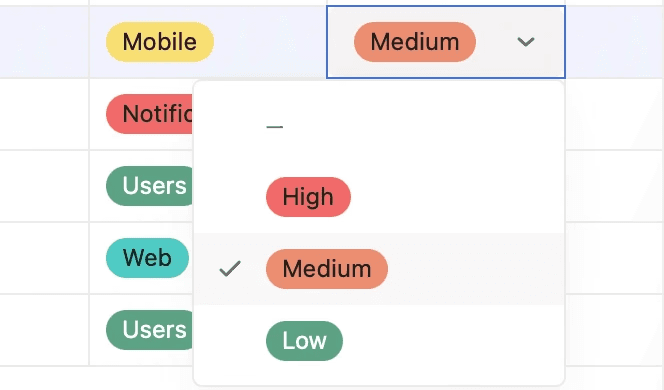
Priority Table
Final Screens – 2024
The team moved forward with the priority tags table because it let users focus on one tag at a time and was determined to be technically feasible. In the final design, I removed the table lines and the keywords' tag styling, creating more space between elements and increasing whitespace, which resulted in a cleaner layout.
Results
Tag priorities help mentors and mentees connect more effectively and build stronger relationships.
The introduction of tag priorities improves compatibility between mentors and mentees. A feedback pop-up feature I designed alongside this collected user responses, showing an early 3.4 satisfaction rating for matches. By focusing on what matters most to each user, mentors and mentees can spend their time building meaningful connections instead of navigating mismatched pairings.
Insights & Takeaways
I'm grateful for the opportunity to revisit this project after 6+ months.
Although the delayed development wasn’t ideal, it gave me the chance to revisit and refine the designs. Since I was initially uncertain about the final solution due to tight deadlines, getting the chance to iterate and adjust the feature allowed me to better align it with user needs and improve the overall user experience. This extended timeline allowed me to rethink and improve upon ideas that were partially developed during the first phase.